How Using Color Psychology in Web Design Fuels Conversions
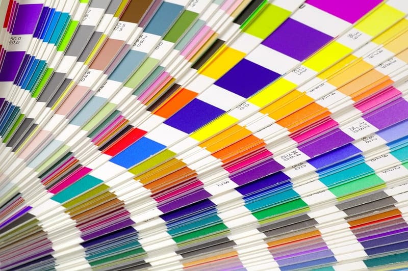
It isn’t something that most of us think about but color has the potential to influence our emotions and even our buying decisions. Through the strategic use of color, you’re able to deliver your brand’s messaging and influence movement through your sales funnel and at the end of the day, this movement is really what it’s all about.
In order for your business to thrive and grow, moving people through your sales funnel and to the point of conversion is absolutely essential. Considering that color can be so influential in our buying decisions, it only makes sense that tapping into color psychology is an effective way to move traffic further along and generate more conversions. Let’s take a closer look at color psychology and why it’s so important for increasing conversions for your business.
The Impact of Color on Consumer Behaviors
So much of what goes into consumer buying decisions is visual. Research tells us that consumers form an initial, although sub-conscious, impression of a product or brand within the first 90 seconds of seeing it – and that between 62% and 90% of this impression is based solely on color.
This means you have a mere minute and a half to influence movement toward conversion and the colors you use carry tremendous weight in this process.
For businesses, the importance of color is often recognized for logo development and for building brand identity but then the theories of color psychology tend to fall off the radar. What we need to be looking at is how to use color through every stage of the sales funnel, including the use of color in web design, to encourage an increase in conversions that will help your business thrive.
When considering the use of color in web development, it’s important to look beyond the basics of color theory. Most of us already know that certain colors are associated with strong emotions. Let’s take blue for example.
The color blue is associated with trust, dependability and strength. Brands like Facebook, IBM and American Express use blue as their primary brand color because they need their audience to feel a level of trust and security in their products and services.
Except, just knowing the general emotions behind the color blue isn’t enough. Although blue is one of the top favorite colors of all audiences, there are subtle shifts in the emotional response to different shades of blue. For instance, one shade of blue is considered to be the favorite among healthy individuals while the very next shade darker is a favorite among people who are considered anxious or depressed.
Such a minor difference, even in the shade, can have a significant impact on your ability to move traffic and generate conversions.
Understanding the Importance of Color in Branding
In a perfect world, people would land on your website, click a CTA and enter the land of conversions on their very first visit. Unfortunately, this isn’t how it works – at all. You need to first attract an audience to your site and then step by step, nurture them through your funnel. Each stage of the funnel is fueled by different emotions and it’s important to know how to use color to appeal to customers at each of these stages.
Let’s start with the basics of color and branding. Basic color psychology can be used to generate initial interest in your brand. As a general rule of thumb, this brief guide describes the colors and their associated emotional response.
- Red: Urgency, passion, high energy, and love. Brands that use red include Lego, McDonalds and Target
- Orange: Warmth, optimism and confidence. Brands that use orange include Nickelodeon, Home Depot and Harley Davidson
- Yellow: Optimistic and playful but can be difficult to look at and should be used carefully. Brands that use yellow include Sprint, UPS and Best Buy
- Green: Growth, health, nature and financial wellness. Brands that use green include Starbucks, Whole Foods and Animal Planet
- Blue: Confidence, trust and loyalty. Brands that use blue include PayPal, Dell and NASA.
- Black: Mystery, power and confidence. Brands that use black include Chanel, Nike and Disney
Generating Movement with Color
There are multiple components that go into influencing movement and conversions with color. For instance, maintaining brand identity and using color strategically in website design to enhance the user experience and to keep visitors on your site longer.
It’s all about knowing how to use the right colors at the right time. When someone lands on your homepage, using color to establish your brand is important. That doesn’t mean that you can’t break away from your branding color strategy to include other color elements that incite action.
Even on a relatively clean and simple home page that includes limited color elements, a pop of high energy, action-oriented color –like red, orange or even hot pink, can catch attention and inspire the visitor to explore further.
The closer you bring the customer to conversion, the more purposeful the use of color becomes. Think about the emotions that are behind your customer’s decision to convert. Are they inspired by your reputation of trust and authority, or do you provide more of a needs-based service that can benefit from the use of red to instill a sense of urgency? It’s important to consider the unique nature of your business when determining how to best optimize color psychology in your own web design.
Don’t Be Afraid to Experiment and Explore
One way that businesses limit themselves is that they’re hesitant to experiment with the use of color for driving conversions. It’s ok to try new colors out and play around with the colors of your website design to test and measure the results of different approaches to color psychology.
If you’d like to learn more about how color can be used to increase conversions for your business, we’re here to share our extensive knowledge of web development and consumer psychology. JLB is a full-service web design company and we’re here to help your business grow. Contact JLB today to learn more.


Have A Project For Us?
Website design services & digital marketing tailored for user experience and
attracting the right traffic for you with support-that-matters!
