The 4 Top Rebranding Trends

Here’s what happened in the world of rebranding:
Online marketing, website designs and then there is branding. Branding should drive your website design and digital marketing focus. Rebranding is the process of taking an established product and giving it a new look and feel as a means of differentiating it from its rivals while also ensuring it doesn’t go stale. There are a number of ways in which organizations attempt to rebrand products including a name change, updated marketing materials complete with the latest ‘buzzwords’, change their website landing page, or create a new logo design.
In 2015, a number of major corporations decided to try their hand at rebranding old favorites. You may wonder why these companies decided to change a good thing but in the modern era, it is necessary to focus on the digital experience of consumers. As a consequence, it is important to rethink color choices, scalability and flexibility while also considering how brand identity works with the Internet.
Now follows the great rebranding trends of 2015 – which should give you some idea about the coming year…
Geometric Sans Serifs
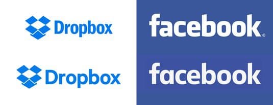
Geometric sans serifs surfaced in Dropbox and Facebook’s rebrands
These sans serifs could be considered quite clinical and cold but they are also simple and in the digital age, simplicity is often the best feature of design. Geometric Sans Serifs are stark which make them ideal for headings.
Major companies such as Dropbox and Facebook got rid of their ‘tech’ look and transformed their logos from condensed to personable in one fell swoop. As well as looking great, geometric sans serifs are more scalable which means they look fantastic even in crammed spaces.

No new logo was more geometric than Google’s!
Google also implemented this sans serif; take note of how the letter ‘G’ in the new Google logo is round which means it is perfect for profile pictures, favicons and avatars in social media.
Geometric Sans Serifs include Futura PT, Allumi Std, P22 Underground and Proxima Nova among others.
Adaptability
This rebranding trend really came on the scene in 2016 and is set to continue its popularity well into 2016 and probably beyond. Organizations are now placing a greater emphasis on highlighting the individual personalities of their members as well as placing the spotlight on their communities.
As a result, it is important to create dynamic brands and logos to support this process; this also has the added bonus of making company products appear more flexible.

Sonos’ rebrand grabbed attention
Consumer electronics giant Sonos provided one of the best examples of rebranding adaptability in 2015. It breathed new life into its branding via a triumvirate of wordmark, gradient and opt-art sunburst. The result was an attention grabbing brand which also paved the way for future creativity.

MTV’s adaptable rebrand was loud for a reason
MTV International was another big rebranding winner in 2015; it integrated the Internet into its television programming and developed a simple yet effective slogan: ‘I am my MTV’. Whether you are a musician or a fan of MTV, you can submit user generated content through Vimeo and Instagram and get the chance to appear on an MTV show!
MTV Bump is the company’s ‘secondary brand’ but it wasn’t forgotten in the great rebrand as it now has a bolder, louder and faster look which combines 3D graphics and emoji in a cavalcade of color.
Crisp and Clean
As we mentioned in number 01, simplicity or minimalism, is a growing trend in the world of design and a host of big corporations decided to clean up their existing logo. They asked their designers to replace chunky fonts with thinner letterforms and looser kerning. Three examples of logos being stripped down to the bare essentials are Coors Light, IHOP and the Wildlife Conservation Society.
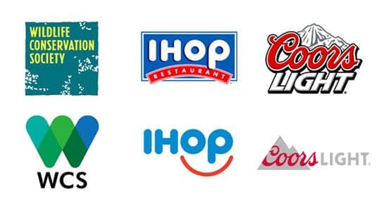
Flat design shows no signs of going away as these rebrands demonstrated
In 2015, it was almost fashionable to get rid of clutter and be left with flatter imagery and straight lines. White space was also implemented to ensure the brand name stood out. Another advantage of minimalism is that simple logos look better when minimized which ensures they look great on mobile devices and even stationery.
Added Personality
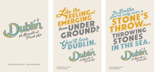
Dublin’s vibrant logotype was designed to reflect the city’s culture
The last thing a brand wants is to appear cold and corporate so in 2015, a number of companies decided to add some ‘fun’ to their logo design with excellent results. A fine example of adding personality to a brand is the Visit Dublin logo which features handcrafted lettering; the vibrant typography really gives you a sense of fun as the different fonts and colors combine beautifully in a design which is truly a ‘breath of fresh air’.

A handmade, artisan feel came to tourism branding in 2015
The tourism industry as a whole embraced this strategy as British Columbia and the state of Ohio got in on the act with their own cheerful and playful logos. Each logo was carefully chosen to represent each location.
Summary
Even successful corporations understand that rebranding is sometimes the best option in order to keep their brand relevant and fresh. While you shouldn’t change your business brand on a whim, take a look at your existing logo design and analyze it carefully. Does it properly represent your brand? Is it crisp, clear and easy to understand? More importantly, does it help distinguish your company from your rivals?
JLB | Beautiful Web Designs + Digital Marketing in Franklin, Brentwood, Nashville TN. Custom Web Design by JLB (jlbworks.com) | Nashville TN, Franklin TN, Brentwood TN Web design, SEO, digital marketing and ongoing support.


Have A Project For Us?
Website design services & digital marketing tailored for user experience and
attracting the right traffic for you with support-that-matters!
