
Google Marketing Live & Google I/O 2026: Key Takeaways for Businesses
June 01, 2026

Whether a website is being viewed on a phone or computer, or being browsed with a mouse or touchscreen, it should look and function properly. Offer website visitors the best user experience by designing for each device.That’s responsive web design. According to Google’s recommendation, this also allows you to share your website with a single URL (great for social media) so Googlebots can easily crawl your website (great for indexing).
Consistency is key to getting your design right — rather than identical appearance and functionality — as these 30 awesome examples demonstrate.
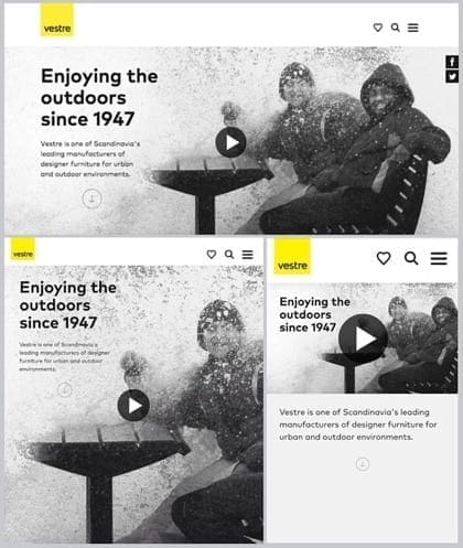
Vestre’s website has a consistent layout across all devices. Apart from the image width, the text placement adapts nicely. It’s always on white, or negative space — when that space shrinks it relocates below the image, still on white space, where it can be clearly read.
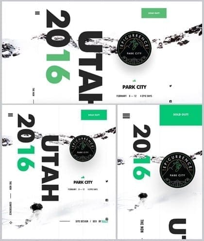
Epicurrence has lots of individual elements laid out in varying manner to suit the dimensions and usability of the screen. But no matter the width of the screen, the circular black logo is always in the same place on the right hand side of the site.
A landscape layout works best for desktop computers, laptops, and other wide screens; and a portrait landscape for tablets and smartphones.
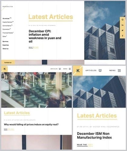
As Kekselias demonstrates, designing with a portrait or landscape orientation for each device can help to convey the most necessary information in a crisp and clear layout.
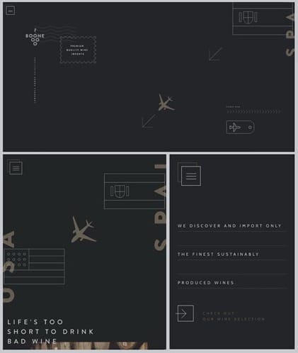
The concept of Boone Selections’ website is to encourage users to scroll down the page, as if to reach the bottom of the barrel — it’s a wine importer after all.
This works great on a desktop, but to eliminate the need for so much scrolling on a smartphone, the website delivers a fine drop of the most important text straight up — a few select words about what the company does.
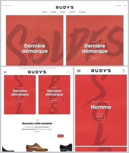
For responsive web design, think about how users will interact with the buttons and links on the screen – via mouse for computers, and with fingers for smartphones and tablets. Make sure, like Rudy’s Paris, the buttons and links are big and fumbling fingers-friendly.
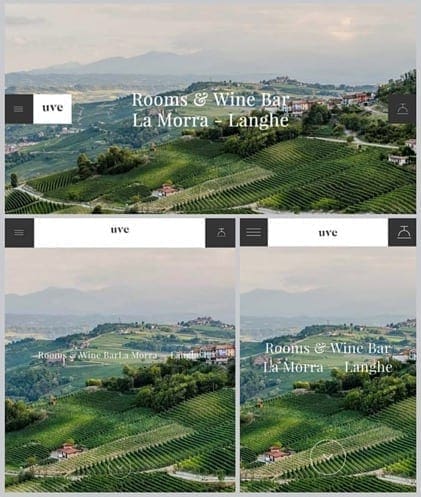
Uve’s refreshing website is just about the same across all devices; just a few subtle adjustments make it that more much functional.
The link to the menu is always to the left and the reservation button always to the right. But they move between top and middle placement, so as not to interfere with the text on narrower screens.
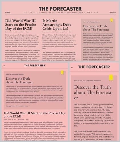
Adjust the font size of headings and body text for each device while ensuring the copy is readable, especially when it’s text heavy like The Forecaster. Aim for about 60-75 characters per line for a desktop and about 30-40 for a smartphone.
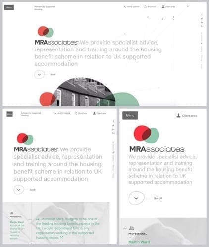
Reducing the amount of visual content on a site makes it easier to download. The visual detail on the MRAssociates website becomes decreasingly less on the smartphone — or increasingly more on the desktop, depending on which way you look at it.
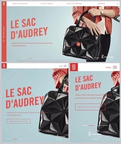
Dans Mon Sac has the same image on the right-hand side of the screen for all devices, but each one is cropped in a slightly different place to suit the width of the screen. This ensures the visual proportions stay harmonious and consistent.
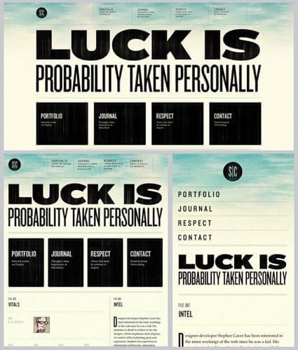
Like Stephen Caver, be strategic about what stays and what goes when you’re designing for different size screens. Focus on the most important content and present it in the most readable fashion. Stephen Caver has eliminated the black boxes for smartphones, listing the most important links at the top of screen.
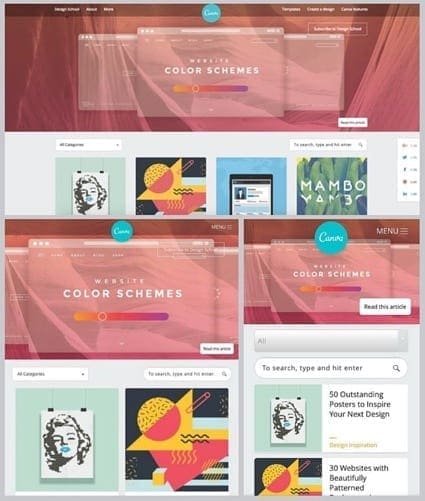
The Design School by Canva scales the number of columns from four-wide on desktop computers, to two-wide on tablets, and only column for smartphones. This ensures layout is clear, text is readable, and links easy to press. The numbers of columns also scale as the size of the browser window is changed.
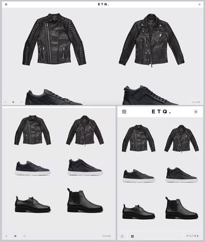
In contrast to Canva’s scaling columns, ETQ-Amsterdam sticks to two columns for all devices giving a consistent and minimalist look to suit the brand. And because there is no text to accompany the images, there is no need to scale columns for readability.
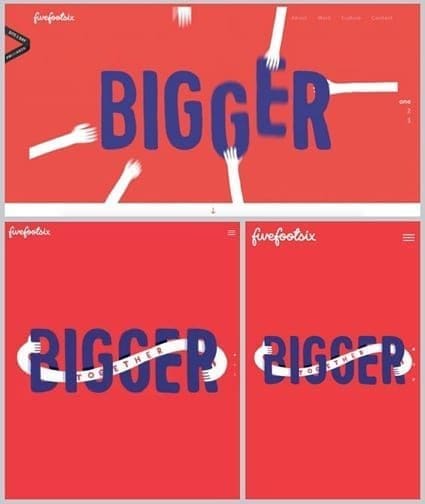
Five Foot Six has an animation on the home page of its desktop website, but a static image for tablets and smartphones.
Animation needs to work perfectly across all devices, and due to the different aspect ratios, portrait and landscape orientations and pixel densities, animations can be challenging on smartphones.
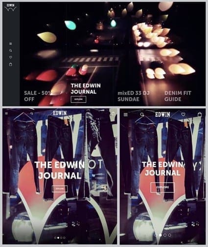
The same background image may not work visually across all devices.
Here, Edwin-Europe uses two different images – one for the desktop, and another for smartphones and tablets. Cropping the desktop screen image to suit a narrower screen would have decreased its effectiveness; it needs the full width of the screen to be understood.
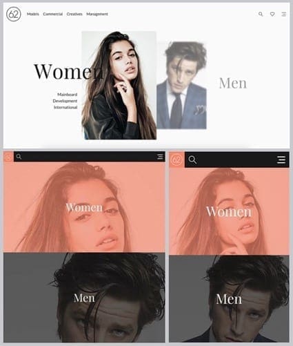
The 62Models site uses images that have been cropped closer and closer for smartphones and tablets; whereas, the desktop site has full images with plenty of white space around them. Either way, the close-ups may not look as effective on the desktop, and vice versa.
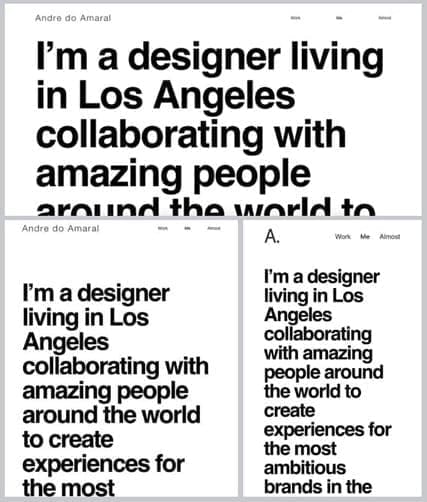
Andre do Amaral’s ‘Me’ page is clear and bold using only black text on white background.
Because the text is the main content it’s important that font sizes are scaled to a) suit each device, and b) suit the browser window. The font size increases or decreases proportionately with the size of the browser window.
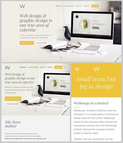
Weblounge has progressively less detail and information on smaller screens. The smartphone site eliminates selected text and visuals in order to deliver only the most important information.
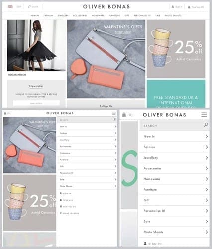
The menu on the Oliver Bonas site is horizontal on desktops and vertical on smartphones and tablets. In addition, the menu isn’t always visible on these smaller devices as it is on the desktop.
But the choice of font and white space keep a consistent look, and increased spacing between lines make the buttons easier to click on for smaller devices.
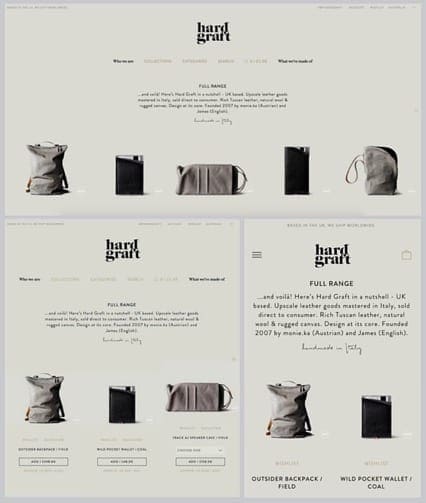
Hardgraft is a great example of a very consistent website across all devices and adapts to the width of the screen – the number of columns decrease or increase; as do the number of characters per line; and the menu is condensed on smartphones.
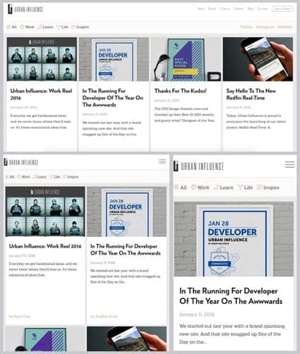
All blog post headings are very clear and easy to read on Urban Influencesdue to scaling the number of columns for each device and choosing a sans serif font, which makes titles easier to read.
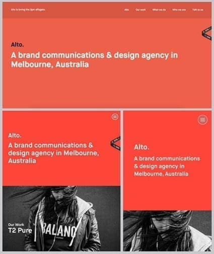
Studio Alto’s bold website is composed of a select number of elements — a red block, black and white image, brand name, text, and menu. Keeping it simple helps to easily manipulate, lay out, or minimize the content for a clean website no matter the device.
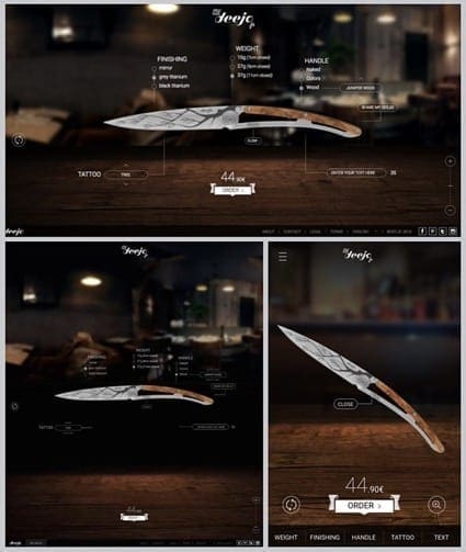
On the My Deejo site users can customize a knife by combining various design options. All the options are visible on the desktop and table, while all the details are minimized and neatly compiled into the footer menu on the smartphone.
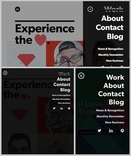
The menu on Brian Hoff Design is identical across all devices — black with bold sans serif white text; and with a slight transparency, the image behind the menu is visible.
Research suggests that smartphone users are more comfortable moving through content by horizontal swiping, while desktop users prefer vertical scrolling.
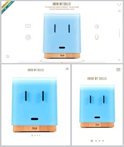
Teye Denkwerk’s website recognizes these differences and is designed for swiping on the smartphone and tablet, and scrolling on the desktop.
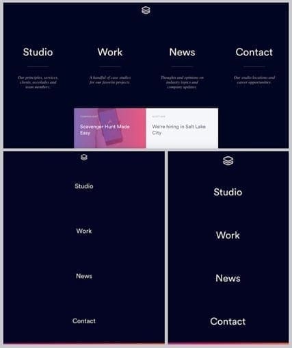
If Teye Denkwerk’s usability is subtle then Impossible Bureau’s is bold and obvious. Basically, the menu is the home page. Four links, each of which lead to the most important content, are laid out either vertically or horizontally depending on the dimensions of the screen.
Using a sticky header can help reduce the amount of scrolling needed to navigate a website.
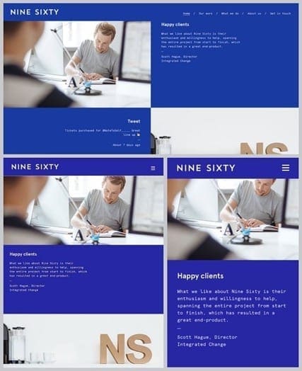
Like Nine Sixty, it means the navigation bar slides out of view when scrolling down, and reappears when starting to scroll back up. This gives a consistent aesthetic and functionality to the website across all devices.
It’s important to design the content of a website with the fold in mind. But designing a website for different devices means the fold will vary, as it also will for portrait or landscape orientation.
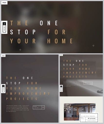
Nevertheless, like Jova Constructions, design with the fold in mind and consider what content users can see on initial page load, prior to any scrolling.
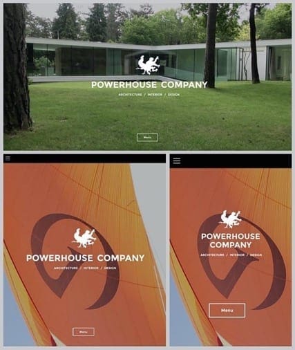
Powerhouse Company has a moving image on the desktop website — and one with a strong horizontal emphasis that maximizes the real estate of the screen.
But neither the moving image or its orientation would work effectively on the smartphone or tablet, so it incorporates a different option.
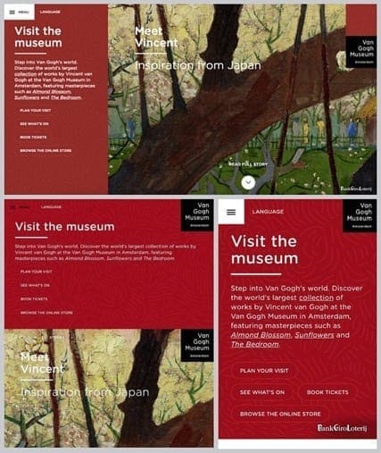
The content on the Van Gogh Museum website is laid out slightly differently for each device.
Text and image are side by side for the wider desktop screen; stacked for the narrower tablet screen; and the image is done away with all together for the smartphone so only the most important content is delivered.
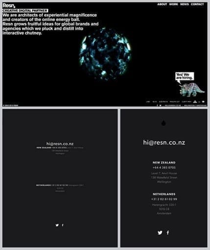
If, like Resn, your website has complex and moving graphics that may not translate well to smaller screens, then do away with them all together. Keep it simple and, in this case, deliver only the contact details.
New devices are introduced to the market all the time, so be sure to test any website on multiple devices, software versions, and screen sizes to keep it looking tip-top no matter where and how it’s viewed and used.
JLB | Beautiful Web Designs + Digital Marketing in Franklin, Brentwood, Nashville TN. Custom Web Design by JLB (jlbworks.com) | Nashville TN, Franklin TN, Brentwood TN Web design, SEO, digital marketing and ongoing support.
Website design services & digital marketing tailored for user experience and
attracting the right traffic for you with support-that-matters!