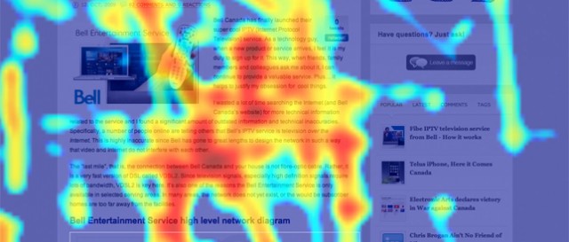
Heatmaps are great for analyzing the behavior of your visitors. They can lead to insights you can’t find using other methods, which can greatly increase your conversion rate.
Heatmaps are roughly divided between mousetracking heatmaps and eyetracking heatmaps. The big majority of companies use mousetracking heatmaps because of it’s price effectiveness. Let’s look into key findings from different heatmap tests.
One of the main differences between mouse- and eyetracking heatmaps is that when using mouse tracking, you are getting data from your actual visitors. Whereas when you use an eyetracking heatmap, you are using a sample group of people who are often taken out of their normal environment, so it may generate distorted results. On the other side, using eyetracking will give you results with close to 100% accuracy about the testing subjects, while the accuracy of mousetracking is around 85-90%.
Next, some findings:
1. Content most important to your visitor’s goals should be in the top of the page
People do scroll, but their attention span is short – This study found that the visitor’s viewing time of the page decreases sharply when they go below the fold. In the study, visitors spent 80% of their time focusing on the content above the fold. The material that’s most important to your business goals should be above the fold.
In the study, user viewing time was distributed as follows:
Above the fold: 80.3%
Below the fold: 19.7%
The study was conducted on a 1024×768 resolution – today, most people have a larger resolution. It will not inherently change the conclusion of the study, but it may alter the percentages a bit – When using a fluid layout on larger screens, the amount of content above the fold may increase.
User attention will also decrease below the fold – the further your content is away from the header, the less attention your visitor has in reading it. So make sure to insert your most important information at the top.
Also, remember that people scroll when the layout promotes scrolling – so if you have a long page, make sure the design encourages scrolling.
Notice the last element on your page
In the same study, the viewing time increased significantly at the very bottom of the webpage, which means that visitor’s attention goes up again in the bottom of the page. Inserting a good call-to-action or relevant content to the end of the webpage can drive up conversions.
You should also remember the recency effect, which states that the last thing a person sees will stay on their minds longer. Make sure to put some time into carefully crafting the endings of your pages.
2. What you see is what you buy – When in a hurry, what sticks out gets chosen
A recent Caltech neuroscience study found out that at rapid decision speeds (when in a rush or when distracted), visual impact influences choices more than consumer preferences do. This means that when your visitors are in a hurry, they will think less about their personal preferences and tend to choices based on what they notice most. This bias will get stronger the more distracted a person is and is particularly strong when a person doesn’t have a strong preference among different options.
This proves a hypothesis for marketers, bearing with it a lot of potential – If the visual impact of a product can override consumer preferences, especially in a time-sensitive and distracting environment like online shopping, then strategic changes to a website’s design can seriously shift visitors’ attention.
Optimize the design of your website, so that your visitors could find what they are looking for (or what you want to sell the most) in an increasingly hasty world.
3. People spend more time looking at the left side of your page
Several studies have found that the left side of the website gets a bigger part of your visitor’s attention. The left side is also looked at first. There are always exceptions, but keeping the left side in mind first is a good starting point. Use this side of your website to display your most important information – for example your Value Proposition.
This study found that the left side of the website received 69% of the viewing time – People spent more than twice as much time looking at the left side of the page as they did the right.
4. People read your content in an F-shaped pattern
This study has found that people tend to read textual content in an F-shaped pattern. What does that mean? It means that people skim and that their main attention goes to the start of the text. They read the most important headlines and subheadlines, but only selectively read the larger parts of the text.
Your first two paragraphs need to state the most important information in your text – This is the content your visitors will most probably read.
Use subheadings, bullet points and paragraphs to make your content more readable. People skim, and when you insert your important information into bullet points, there’s a bigger chance they will notice it while skimming the text.
5. Don’t lose money through banner blindness
Banner blindness happens when your visitor subconsciously or consciously ignores a part of your webpage because it looks like advertising. This phenomenon has been around for a long time – We are bombarded daily by thousands of ads, so we have subconsciously learned to ignore advertising on websites. This also means that any block of text or images that may look like advertising will be ignored. Visitors almost never look at anything that looks like an advertisement.
This heatmap study found no fixations within advertisements. If people need to get their information fast, they will ignore advertising – and vice versa, if they are completely focused on reading a story, they will not look away from the content.
There are several ways to avoid creating banner blindness on your website – most of the problems can be prevented by using a web design company that is experienced in online marketing.
6. When using an image of a person in your design, it matters where they look
It makes sense to use people in your design – it’s one of the design elements that is good for attracting attention of your visitors. But it also matters where their eyes are looking – Several heatmap studies have shown that people follow the direction of the model’s eyes. So if you need to get people to focus not only on the beautiful woman on your website but also on the content next to her, make sure she is looking at that content.
It’s also important to convey emotion
Having a person convey emotion can have a big impact on conversion rates.This study found that a person conveying emotion can have a larger impact on conversions than a calm person looking at the call to action.
Your best option may be to combine these two approaches – use an emotion-conveying person, looking at the desired spot on the page.
7. Men are visual, women seek information
When asked to view profiles of people on a dating site, a study found a clear difference between men and women – while men are more visual when looking at a profile of a person, focusing more on the images, women tend to read more of the info being provided. Women spent nearly 50% more time in evaluating someone’s general profile, while men tended to focus most of their attention on images.
8. Abandon automatic image carousels and banners for better clickthrough rates
This study concluded, that on two sites where the users had a specific task in their mind, the main banners were completely ignored – also the animated version. These kinds of solutions are being used on a lot of the websites, but it’s mostly a fad. Automatic image carousels and banners are generally not a good idea for you homepage. They will be ignored by your visitors because they generate banner blindness and therefore waste a lot of necessary space on your site.
The same study found an exception to this rule in of the sites – the central banner on ASOS’s homepage managed to capture the attention of the participants better than the other sites. So how is that banner different? It probably looks less like a banner, being more integrated into the page than the other image carousels in the test, so it doesn’t generate the banner blindness effect quite that much. Still, it’s not a perfect solution.
9. Use contrast wisely to guide your visitors
After testing a landing page with heatmaps to find out user behaviour, the guys at techwyse found out just how important color contrast is in guiding the visitor. A non-clickable, informational element about pricing on the frontpage gathered the most attention because of its color contrast with the surrounding area – Diverting away attention from the rest of the page. After a slight design – focused makeover on the frontpage, the scanning patterns of visitors became aligned with what the company needed.
10. 60-year olds make twice as many mistakes as 20-year olds
When your target audience are elderly people, make sure to focus on making your website as easy to use and clutter-free as possible. When testing 257 correspondents in a remote user test, the failure rate for tasks was 1.9 times greater for the over-55-s than it was for under-25-s. Almost twice as many older people failed or abandoned the given task, as compared to younger people.
Older people are also slower online – Compared to the youngest participants, the oldest took 40% more time to complete a task.
Twice as many older people found the task difficult – Even if doing a random task on your website may feel very easy to you, there’s a good chance that for elderly people, it may be very difficult. So if you have elderly people as your target audience, make sure to test you layout on them.
11. Use photos to get your visitors to pay attention
People are visual – Sites have been using well-selected images to boost conversion rates since the dawn of internet, and with good reason. Including a well-selected image to your offering is almost always a good idea.
Use photos of real people
People respond well to images of real people. In this study, the test subject spent 10% more time viewing just the photos of employees than reading the content which was on most of the webpage. In contrast, visitors completely ignore stock photos of “real people”. Somehow we have learned to recognize “photobank people” from photos of actual people.
Use product photos to boost conversions
There has been more talk about this in this article. When used well, big photos are a guaranteed way of getting your visitor’s attention. 37signals does this well with Highrise.
12. Summaries are better than full articles in blog structures
This study has found, that using article summaries instead of full articles on your blog homepage will make your visitors read more of your content.
If you have a blog with full articles on it’s homepage, you risk losing visitors if they don’t find your first article interesting enough. They will “use up” all their interest in reading the first article and don’t have enough left for the rest of your blog or website.
The first two examples show blogs that display full articles on their front page. In both cases, visitors scanned through the first article, but didnt look any further. The next two examples have only article summaries on their homepage – on the Capgemini blog, the visitor scanned the whole page, which included 10 article summaries. The final example from AOL displays a hybrid approach – Some articles are short and shown in full, while longer articles have been summarized. The Aol example also shows clearly how photoblogs can captivate visitors’ attention – the test subject scanned more than 12 000 pixels, looking only at the photos and ignoring the text.
Using summaries instead of full articles on your blog homepage is superior, because summaries let you show visitors a wide selection of topics. Offering a wider choice of articles increases the likelihood, that your visitor fill find something of interest and will click to read more, instead of leaving your site.
13. People spend less than a minute on your e-mail – captivate them fast
This study revealed that 67% of the users had no fixations within newsletter introductions. People tend to skip the introducty paragraphs in newsletters and scan through the rest of the content. With the average time allocated to a newsletter being 51 seconds, people fully read only 19% of newsletters. They mostly scan, so keep your newsletters short and to the point, with a clear call – to – action.
14. Combine A/B testing with clickmaps for increased effectiveness
The people at visual website optimizer found out that nearly 25% of their homepage traffic goes to a tiny “pricing” link at the top menu, while the big, main CTA button created to gather most of the traffic, only gathered 5% of the total clicks. Now that they found this out, they can combine the previous clickmap knowledge with A/B testing to find out what version of a changed homepage will work better.
In website split testing, you can direct traffic between two or more versions of the same page, to analyze the success of each. For example, you can play around with button colors, background colors, copywriting or placement of elements. Sometimes you may see huge changes in visitor behaviour with the smallest changes in your page design – for example a color change of a button can result in higher conversions. When you combine the knowledge gotten from clickmaps with A/B testing, you can increase the effectiveness of your clickmaps many times – CareLogger achieved a 34% increase in conversion by changing the color of their call-to-action button.
15. Displaying the discounted price next to the original one will increase purchase satisfaction
Inspired by Dan Ariely’s book “Predictably Irrational”, Robert Stevens did a test with 60 random people to see how relativity affects everyday decision-making. People don’t make decisions based on full information about the world – We make decisions based on the information that we have available at the time we make them.
People were tested with two different shelf layouts for smoothies – The first version had only the discounted Innocent smoothies visible, with none of the smoothies from the same brand that had a full price. The second version also included a selection of smoothies with a regular price. While the price for discounted smoothies was left unchanged, people were more satisfied with their purchase when they also knew about the original price – 2.4 vs. 1.7 on a likert scale.
Eyetrack III research on news portals
In the Eyetrack III research several dozen people were observed for one hour as they were given mock news websites and real multimedia content to visit.
16. People’s eyes fixated first on the upper left of the page, then hovered in an area to the right – only after some time did people start exploring further down the page;
17. People see dominant headlines first – Especially when they are in the upper left corner;
18. Use smaller type for focused reading behaviour – The study found that larger type resulted in more scanning of the page, because people looked around for words or phrases that captured their attention, while smaller type resulted in people focusing more on the content.
19. The first words of your headline are important – If the first words of a headline engage your visitors, they will be likely to read on. You will have less than a second to get their attention.
Tip: Build a conversion rate heatmap by hour and day of week
If you are interested in seeing a good overview about your conversion rates by time of day and week, then check out this tutorial – Robert Kingston from Optimisation Beacon has written a good article on creating an informative spreadsheet about your conversion rates by the hour and day of week – Great for e-commerce sites, will produce a heatmap-like overview of your peak conversion times.
Tools for your own heatmap tests
While these surveys will have hopefully given you some insight into what may work, it’s best if you do your own tests. There are quite a few good companies out there that offer excellent tools for testing out your pages. I will be focusing on mousetracking software, because it is more widespread, affordable and way easier to step up when compared to eyetracking software:
Crazyegg – A great tool for mousetracking tests. Features a click heatmap, scrollmap, overlay for number of clicks on specific elements and confetti, which you can use to distinguish clicks based on referral sources. They claim to have up to 88% tracking accuracy when compared to eyetracking tests. All plans are free for 30 days, pricing starts from $9 / month.
Mouseflow – Another good tool for mousetracking. They put a lot of emphasis on playback and record all mouse movements – clicks, scroll events, key strokes and form interaction – You can even record visitors’ keystrokes when filIing up forms. In addition they have separate options for e-commerce tracking. Pricing starts from $10 / month and they also have a small, forever free plan.
Clicktale – Enterprise-level mousetracking software, used by bigger brands. The software is divided into Mouse Tracking Suite for tracking mouse movements, Heatmap Suite for a visual overview and Conversion Suite meant to deliver better analytical data for conversion optimization. Comes with a 400 pageviews / month free plan, need to ask for a price quote for more views.
Reinvigorate – Their real-time heatmap tools have some neat options, like giving name tags to your registered users, so you can see every user’s activity on your site separately. They also have desktop delivery, so if you don’t want to log in on a website to see your data, you don’t have to. Free plan for 14 days, pricing starts from $10 / month.
Luckyorange – In addition to mouse movement recording, they have also bundled tools like real-time visitor maps, visitor polls and live chat into their software. Has a 7-day free trial, pricing starts from $10 / month
Free alternatives
Heat Maps by SumoMe – A free Heat Map tool that works on all websites and has a free WordPress Plugin.
Clickheat – An open-source alternative that allows you to create a heatmap from mouseclicks on your site.
Corunet – You need someone who knows how to code to use this one. Similarly to Clickheat, Corunet will allow you to generate a heatmap from click data on your pages.
Conclusions
Heatmaps can be created from many different types of data. When talking about conversion optimization, we are mostly talking about heatmaps that are created with data from mouse movements or clicks – Both of these come from mousetracking.
- Content most important to your visitors’ goals should be on the top of the page – People do scroll, but their intensity of attention diminishes along the way.
- People buy what they see – Use visual saliency to highlight what is important. Visual saliency is a distinct quality of an object (like color) which makes it stand out from it’s neighbours and immediately grab attention. Use this to highlight the products you want to sell.
- Test for banner blindness – When elements on your website resemble advertisement banners, they will get less attention.
- Abandon automatic image carousels to get better clickthroughs – When the users have a specific task in mind, they will completely ignore the carousels.
- Use photos for attention and guidance – People respond well to images of real people and good product photos. You can guide your visitors’ movement on your page through displaying eye direction.
- For blogs, summaries are better than full articles – You will get your visitors to read more of your content by using summaries, because displaying full articles can use up your visitors’ attention before they find what they are looking for.
- Combine A/B testing with clickmaps for better effectiveness – These two methods used together in one analysis can give much more information than the sum of it’s parts.