The Science of Colors in Marketing and Web Design
We came across this article from Think Brilliant by Dave posted on April 9, 2010, and found it quite interesting. Tell us what you think.
“Color has been used as a catalyst for affecting human mood and behavior in marketing for centuries. Today, similar principals of color psychology are being utilized across the web to insight interaction and emotion from onlookers and consumers alike.
 What is it about colors that make someone feel differently toward products or places? Are people more likely to be hungry in rooms with red walls? Are we more likely to be calm in blue surroundings or more apt to buy a product based on the boldness of attention grabbing colors like yellow? Numerous studies have been conducted in attempts to decipher correlations between colors and human behavior, and while some professionals remain skeptics you can bet that businesses don’t. So how much validity is there in this spectral dispute?
Well, to put it simply: A LOT. For sighted people, color is a constant. It’s omnipresent. It’s everywhere. There’s no escaping it, that is, of course until you close your eyes. Oh wait, there maybe some color there too…gahh!
Most of us are so immune to color that we do not even realize how it affects our mood or behavior. Advertisers and marketers have spent vast amounts of time and money in attempts to sway or engage consumers into utilizing their services or buying their products. It is not by accident that the CocaCola™ logo and cans have remained red for decades. In fact, even the mention of CocaCola™, probably had you immediately associate the product with the color red.
Quite naturally, similar color principals have made their way to the web as it is primarily associated with being a visual tool. Any seasoned designer will know, at least, the basics of color interaction and combination to positively impact visitors’ first and sustained impressions.
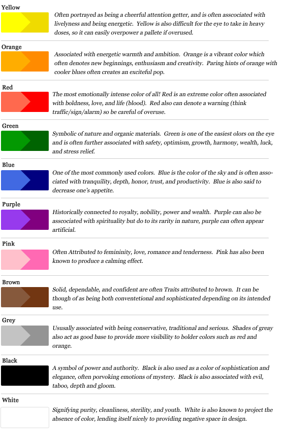
While different cultures retain individualistic adherences to colors and schemes alike, in the western world color sentiment is usually depicted as follows:
Many, would argue that in web design, sites are not made up of just one single color from which to conjure emotion, but rather construed of a series of colors making up a scheme. Even so, through proper color combination you can see a predominancy of underlying tones. For example, let’s take a look at three different auto manufacturer sites:

First to the plate, we have Jaguar. A powerful luxury auto manufacturer who markets and caters to individuals of affluence. Note the predominance of black, signifying power and sophistication with subtle hints of white and blue often associated with purity and tranquility. In a sense these colors are conveying that the product itself, while powerful, will be a serene experience to operate.

Keeping in the realm of luxury, next up we have Bentley. The prestige and class that Bentley is known for shines through the sites use of white and grey, with subtle hints of black tying together its elegance.
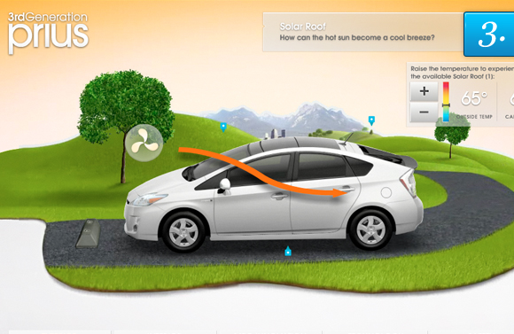
And finally, we have the Toyota Prius. Ahh the Prius. It may be a bit sluggish, but it’s good for the environment. Right off the bat, you can notice the major splashes of green, that is meant to signify, you guessed it… being “green”. The use of orange relates to ambition, energy and new beginnings. A perfect fit for this environmentally sound machine.
Putting it all together: So what is the point of all of this? The main thing here is that when beginning a new project, whether it be marketing, branding, identity, or design think about who your target audience is. What kind of emotion do you want your visitors or customers to feel not only on first glance but when they use your product or service. Colors can be a powerful tool to entice and engage your target audience, and if properly used can be extremely beneficial to your marketing success.”


Have A Project For Us?
Website design services & digital marketing tailored for user experience and
attracting the right traffic for you with support-that-matters!

