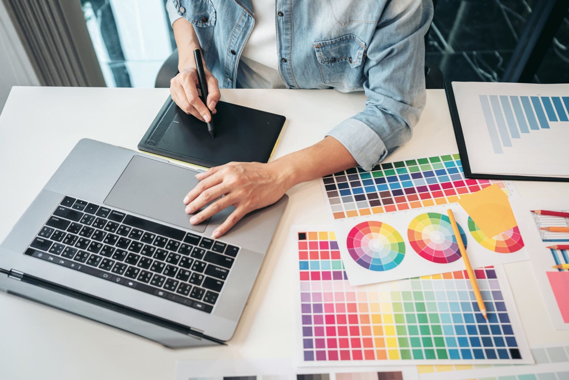
10 Graphic Design Mistakes to Avoid

Graphic design plays a crucial role in capturing audience attention and conveying brand messages effectively. However, even the most well-intentioned designs can fall short if they overlook key principles. In this blog, we’ll explore 10 common graphic design mistakes to avoid, ensuring your visual content stands out in the competitive landscape.
1. Ignoring Brand Identity
Every design should reflect the unique identity and values of the brand it represents. Ignoring brand guidelines or deviating from established aesthetics can confuse audiences and dilute brand recognition. Aligning graphic elements with brand colors, fonts, and imagery is essential for maintaining consistency and reinforcing brand identity.
2. Poor Font Choices
Typography plays a significant role in graphic design, yet many designers overlook the importance of selecting appropriate fonts. Using too many fonts or choosing ones that are difficult to read can detract from the overall visual appeal and readability of the design. Opt for legible fonts that complement the brand aesthetic and convey the intended message effectively.
3. Cluttered Layouts
Cluttered layouts overwhelm viewers and make it difficult for them to focus on essential elements. Avoid overcrowding designs with unnecessary text, images, or graphics. Embrace white space to create breathing room and guide the viewer’s eye towards key focal points. A clean and well-organized layout enhances visual clarity and improves overall user experience.
4. Lack of Visual Hierarchy
Effective graphic design relies on establishing a clear visual hierarchy to prioritize information and guide viewer engagement. Without proper hierarchy, viewers may struggle to discern the most critical elements of the design. Utilize size, color, contrast, and placement to create hierarchy and ensure important content stands out prominently.
5. Inconsistent Branding
Consistency is key to building brand recognition and trust among consumers. Inconsistent branding across various platforms and marketing materials can erode brand credibility and confuse audiences. Maintain uniformity in design elements such as logos, colors, and imagery to reinforce brand identity and strengthen brand recall.
6. Overuse of Stock Imagery
While stock imagery can be convenient, relying too heavily on generic photos can make designs appear impersonal and uninspired. Invest in custom photography or illustrations whenever possible to create unique and authentic visual content that resonates with your audience. Custom imagery adds personality and authenticity to designs, setting them apart from competitors.
7. Poor Color Choices
Color psychology plays a significant role in influencing consumer perceptions and emotions. However, selecting the wrong color palette can have unintended consequences and detract from the desired message. Conduct research on color theory and consider the cultural associations of different hues when choosing colors for your designs. A harmonious color scheme enhances visual appeal and reinforces brand personality.
8. Inadequate Image Resolution
Low-resolution images can detract from the overall quality and professionalism of a design. Always use high-resolution images to ensure crisp and clear visuals, especially for print or digital media where image quality is essential. Prioritize image quality to maintain visual integrity and prevent pixelation or distortion in the final output.
9. Lack of Mobile Optimization
In today’s mobile-centric world, failing to optimize designs for mobile devices can alienate a significant portion of your audience. Ensure that graphics are responsive and scalable across various screen sizes to provide a seamless user experience on smartphones and tablets. Mobile-friendly designs enhance accessibility and cater to the preferences of on-the-go consumers.
10. Neglecting Feedback and Testing
Finally, one of the most common mistakes in graphic design is neglecting to seek feedback and conduct testing before finalizing designs. Solicit input from colleagues, clients, or target audience members to gain valuable insights and identify areas for improvement. Iterative testing allows designers to refine their creations and ensure they resonate with the intended audience effectively.
Reach Out to JLB Works Today
By avoiding these common graphic design mistakes, you can elevate the quality and effectiveness of your visual content, ultimately driving greater engagement and brand success. Remember to prioritize brand identity, readability, and user experience in all your design endeavors, and don’t hesitate to seek feedback and iterate on your designs for optimal results.
Contact JLB Works today to improve your SEO rankings overnight.


Have A Project For Us?
Website design services & digital marketing tailored for user experience and
attracting the right traffic for you with support-that-matters!


